What Each Color Actually Does
Aug 25, 2026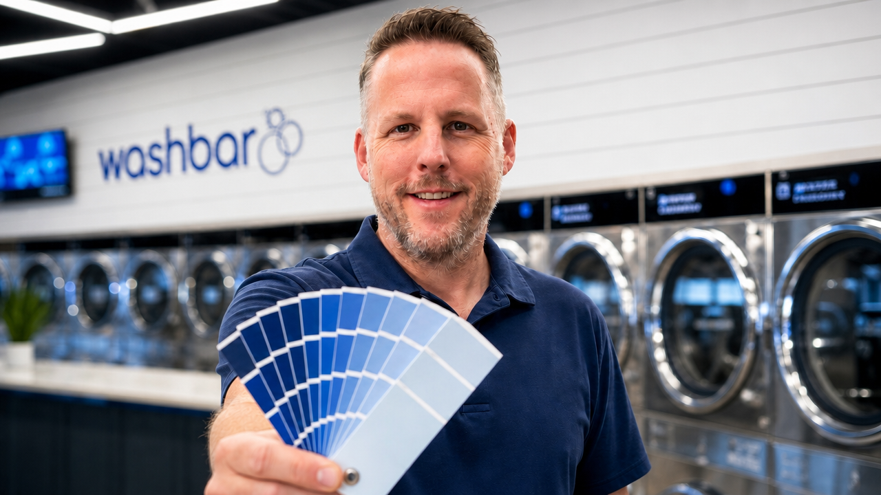
What Each Color Actually Does
Blue, green, yellow, red, and the 90 minute customer.
People (my wife) thought I was overdoing it when I spent several days inside a Sherwin Williams mixing one color of blue. Adjusting it. Coming back. Adjusting it again. For paint.
But I knew something they did not. That one color was about to go on every door, every accent wall, every front counter, and every baseboard in every store we would ever build. Get it right once, and I could replicate it forever. Get it wrong, and I would be looking at the mistake in every location for years.
Walk into any Sherwin Williams in Southern Oklahoma and ask for Wash Bar Blue. It is in the system.
The first two issues of this series made the case that color is a business decision and that the right choice depends on your customers, not your taste. This issue is the tactical one. Your customer stands in your space for 60-90 minutes, and every color in the building is working on them the entire time. Here is what each one is actually doing.
There is a reason banks, hospitals, and airlines live in blue, and it is the same reason we bet our entire brand on it. Blue reads trustworthy, calm, and clean, and in this business that combination is everything. A customer handing over their family's clothes is making a small act of trust, and blue quietly tells them that trust is safe here.
Blue was also the most universally accepted color we tested, which mattered because our clientele is everybody, from red wagons to Range Rovers. Six years later it has not dated a single day.
One warning. Blue only reads clean when it is paired with bright white and strong light. Blue on every wall under weak fluorescent tubes stops feeling calm and starts feeling cold. Blue is a partner, not a soloist.
Green reads clean in a different way than blue does. Blue says sanitized and safe. Green says natural, fresh, alive. It is the color of fresh air and open windows, which is not a bad message for a business whose entire product is freshness.
The trap with green is that the wrong shade goes institutional fast. There is a version of green that reads like the hallway of an aging hospital, and it will age your store the same way. If you go green, keep it crisp, use it as an accent rather than a blanket, and pair it with plenty of white.
Yellow grabs the eye faster than any color on the spectrum. That makes it a useful tool at small scale, a sign that needs to be found, a moment of energy in a kids corner. And it makes it a liability at wall scale.
I told you in the first issue of this series about the laundromat I looked at buying near one of our stores. I want to come back to it, because it is the perfect cautionary tale for this exact color.
The whole store was Tweety Bird yellow, wall to wall. It was gaudy.
The owner clearly liked yellow. But a color that energizes the eye for four seconds exhausts it over 90 minutes, and that is the math that matters in our business. Those kinds of colors do not make people want to stay longer, and people who do not want to stay do not spend. Personal preference chose those walls. The clientele pays for it.
Red raises energy, triggers appetite, and creates urgency, which is exactly why the drive-through world is drenched in it. Fast food wants you moving. Your laundromat customer is doing the opposite of moving. They are waiting, and many of them arrived already stressed.
So keep red at arm's length, literally. Red belongs at point of sale scale, and notice that your vending machines already come wrapped in it for a reason. Red at wall scale, surrounding a person for an hour and a half, does not create urgency. It creates agitation, in a room where people are counting minutes.
You know from the first issue where I stand on all white stores. White alone is not a design, it is an absence of one. But white in partnership is a different animal entirely. Our walls are bright white on purpose, because white is the amplifier that makes our blue pop, bounces light deeper into the building, and makes clean look clean.
White is the canvas, never the identity. It does its best work making your one committed color impossible to miss.
Here is the ingredient that changes every color in the building, and most owners never touch it. When we upgraded our first store to LED, lighting alone made the space 4-5X brighter, and the exact same paint suddenly worked twice as hard. Dim light makes clean stores feel dirty. Bright light makes every color you chose tell the truth.
Lighting alone made the store 4-5X brighter.
And nothing beats the light you do not pay for. Every store we build has as many windows as we can get, and our newest has an eighteen foot tall glass garage door we roll up on nice days. Daylight is the warmest thing you can put in a modern store, and it costs nothing once the glass is in.
If you take one tactical rule from this issue, take this one. Brightness before hue. Fix your light first, then judge your colors, because you cannot evaluate paint under lighting that is lying to you.
None of these colors is magic on its own. Blue does not print money and yellow does not burn your store down. The difference is whether every color in your building was chosen on purpose, for people who sit inside your choice for an hour or more at a time.
Which brings us to the finale. Next issue we talk about those people. What an intentional space does to the customer who needs that hour to go easy, and to the employee who spends 40 hours a week inside the walls you picked. That is where this whole series has been headed.
Before I bought my first laundromat, I visited well over a hundred of them in less than a year. I did not just walk through. I would sit, sometimes for hours, and watch. Which machines people figured out without help. Which seats people chose and which sat empty. Where people stood when they had nowhere they wanted to be.
Nobody was teaching a class on any of this, so the stores became the class. Everything in this series, the blue, the white, the light, the seating, came out of those hours of watching real people use real spaces. You do not need a design degree to get this right. You need a chair in somebody else's store and the patience to sit in it.
One committed color, applied where hands and eyes go: doors, the accent wall, front counters, baseboards. That is our exact formula, and it means one color does the work of a full redesign without repainting the whole building.
Put swatches on the wall at least three feet wide, then live with them. Look at them at opening, at noon, and under your night lighting before you commit. A color that works on a two inch chip can fail on four hundred square feet of wall.
Audit your store for red at wall scale. Red earns its keep on vending fronts and point of sale moments, where urgency helps you. Anywhere a waiting customer has to sit inside it for an hour, swap it out.
Price the LED upgrade before you price the paint. We made our first store four to five times brighter with lighting alone, and it changed how every color in the building performed. Judging paint under bad light is judging it blindfolded.
Everything this week came from years of studying how people respond to space, and from testing it with our own money in our own stores. Inside Laundry Advisors, members skip the years. They walk our locations, see the accent map in person, and get direct answers about what will work in their market before they spend a dollar on paint or fixtures.
Laundry Advisors is a no obligation, month to month membership. We also protect our members: if your direct competitor is already in, you cannot join. What works in your market stays yours.
Our weekly subscribers go to the front of the application/interview line. If you are ready to make every color in your store earn its keep, this is where it starts.
Stay connected with news and updates!
Join our mailing list to receive our weekly blog.
Don't worry, your information will not be shared.
We hate SPAM. We will never sell your information, for any reason.